Carbon data wrangling.
*what is special about the data?
*what stories can be drawn from the data?
*correlation between the attributes?
On the table
One month down and 5 people with unique backgrounds have worked a raw spreadsheet with carbon emission data. I am truly proud to have been part of a talented team! We cleaned, analyzed, and visualized spreadsheet data. I am passionate about the environment and the opportunity to work closely with carbon emission data could not have come at a better time. Working with my team through this exercise allowed me to learn one or two things about data wrangling, it was a nice stock taking tool (it’s good to check yourself once in a while) and I was a little curious about how working together remotely would turn out. Thanks to School of Data.
Tools
E-mail, Google’s products (G+ hangout for a real feel of who your team-mates are, docs for collaboration) and Ether pad, aided communication. Meeting time had to be scheduled using a doodle poll but was not a popular choice for the team. The second option which was email turned out to be a tall order because we had to manually sync time zones between Uganda, South Africa, Russia, Romania and the United Arab Emirates. I actually realized that you have to work almost twice as much with remote team work especially if it’s a size able team (>3 is big)-smaller is better and allows you to concentrate and keep a tab on each team member’s contribution. The latter also makes for easier peer reviews.
Team
Anna and Sipos made great facilitators (Journalist background at work?) while Jakes carried the day when it came to research on coal’s contribution to carbon emissions especially in South-Africa(He is a professor of research methods so we understood why he had a strong affinity for more and more data ). Irina made great strides with documenting all that we did(even in pictures) . I liked moving the data around, splitting it and seeing how visually appealing this carbon data would turn out. By this time we had our data cleaned and ready to merge with the plethora of datasets from the team.
Data served
We came out very clean after the mission with carbon emission data that was easier to reuse (for example merge with other datasets) and comprehend. A detailed write up on what the dataset contains was mentioned earlier in the Guardian.
We actually went ahead to combine the original carbon emission dataset with others that were differently themed: for example, GDP and forest cover data.
This was not only about data, I got another version of teamwork/playing(purely remotely this time), communicating technical terms in simple ways, relevant communication through email for example(I did not have the luxury of going over to someone’s desk and pointing out a few things, I had to be spot-on), facilitating a meeting online(G+ hangout) and having the entire team on the same page and lastly teamwork might not be about getting things done but also the process of getting that work done. It’s therefore not a bad idea to drop a line or two to let your team-mates know you’re checked-in : this will keep the team spirit up.
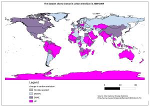
During this exercise, we got to know which folks make our air dirty, at a glance that is- we should be doing something about it in due course! And my experience with Mission control gets to grace Dataspa as she debut’s working with data.
Dataspa will share how she harnesses technology for data – this is multi faceted I must say.
Web links that gave perspective
Constituted the tools to achieve this collaborative effort.
Fruity overtones
http://datadrivenjournalism.ru/ #Irina and Anna
http://info.p2pu.org/2013/06/18/data-mooc-results-findings-and-recommendations/?utm_source=rss&utm_medium=rss&utm_campaign=data-mooc-results-findings-and-recommendations #Our team (10) rocked!
http://info.p2pu.org/2013/06/17/data-explorer-mission-from-the-inside-an-agents-story/ #Anna’s story
http://thematicmapping.org/downloads/world_borders.php #Source of world boundaries shapefile
